10 Modern Staircase Gallery Wall Ideas | Family Photo Frame Layout for Hallways
A staircase wall sits empty in a lot of homes simply because it’s an awkward shape to decorate. The sloped line makes standard gallery wall advice harder to apply directly.
A well planned photo gallery turns that same tricky wall into one of the most personal spots in the house. It just takes a bit more planning than a flat wall would.
This guide covers 10 ways to lay out a staircase or hallway gallery wall that actually looks intentional.
1. Choose a Layout Pattern Before Buying Any Frames
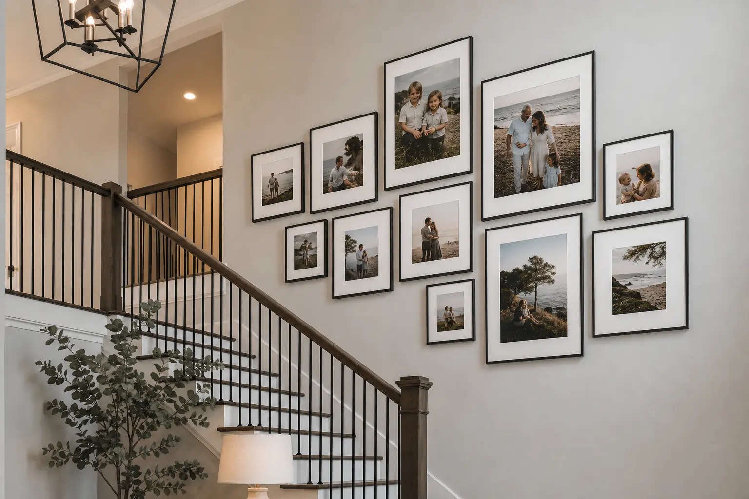
Decide on a general layout style, grid, staggered, or organic, before purchasing any frames. This decision affects how many frames you’ll need and what sizes actually work together.
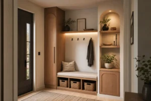
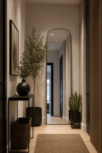
A grid layout needs matching frame sizes and consistent spacing. A staggered or organic layout allows more variation but still needs a plan so it doesn’t look random.
Sketching a rough layout on paper first, even a simple one, saves time and money compared to buying frames and figuring it out on the wall.
2. Follow the Staircase Line With a Staggered Diagonal Layout
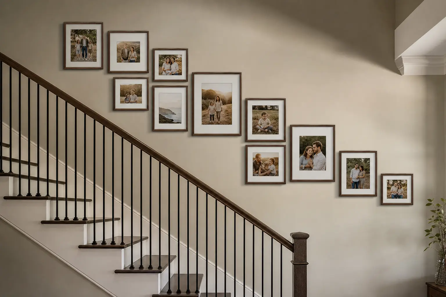
A staggered layout that follows the angle of the stairs is one of the most popular staircase gallery styles for a reason. Frames step upward in a loose line that mirrors the staircase itself.
This approach forgives small inconsistencies better than a strict grid would, since the diagonal line is doing most of the visual work. Leave slightly more space between frames than you would on a flat wall gallery, since the eye is already following a diagonal movement.
Getting the Angle Right
Measure the rise of your staircase and use that ratio to guide how much each frame steps up relative to the one before it, rather than guessing by eye alone.
3. Use a Grid Layout for a Cleaner, More Formal Look
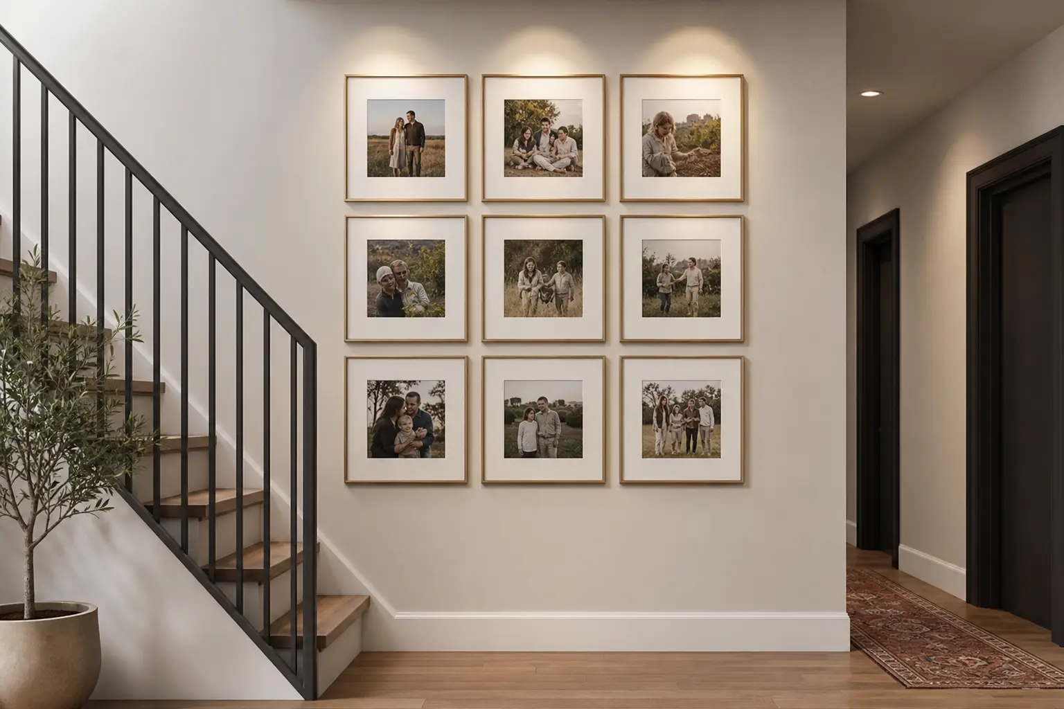
A grid layout with matching frame sizes and equal spacing creates a more formal, structured look than a staggered arrangement. This works particularly well in a hallway with more consistent wall height rather than directly on the sloped staircase wall itself.
Consistent spacing, usually two to three inches between frames, is critical for a grid to read as intentional. Even small spacing inconsistencies stand out more in a grid than they would in a looser layout.
4. Mix Frame Sizes to Add Visual Interest
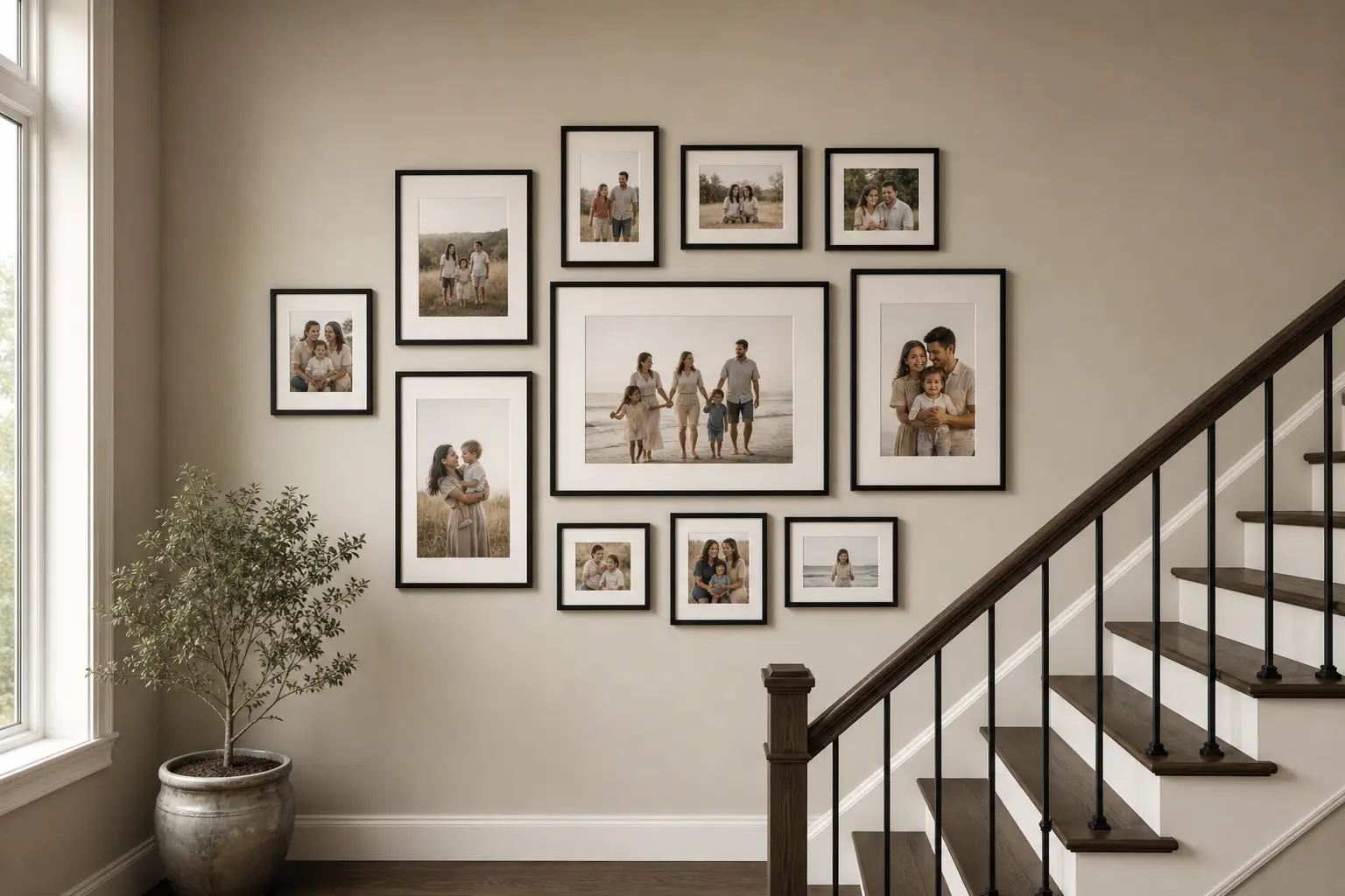
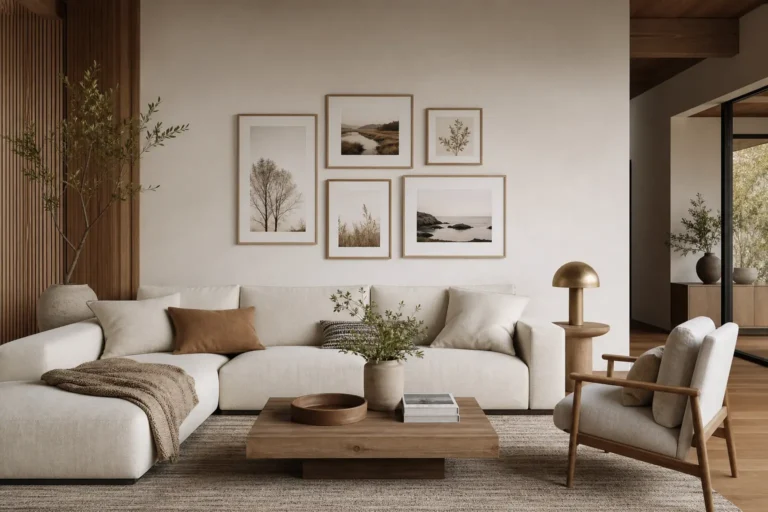
A wall of identical frame sizes can look monotonous over a long staircase run. Mixing two or three sizes, while keeping the finish consistent, adds visual rhythm without looking chaotic.
Use larger frames for a few standout photos and smaller frames to fill in supporting images around them. This hierarchy helps guide the eye to the most important photos first.
Avoid using more than three different frame sizes, since too much variation can start to look unplanned rather than curated.
5. Keep Frame Finishes Consistent for a Cohesive Look
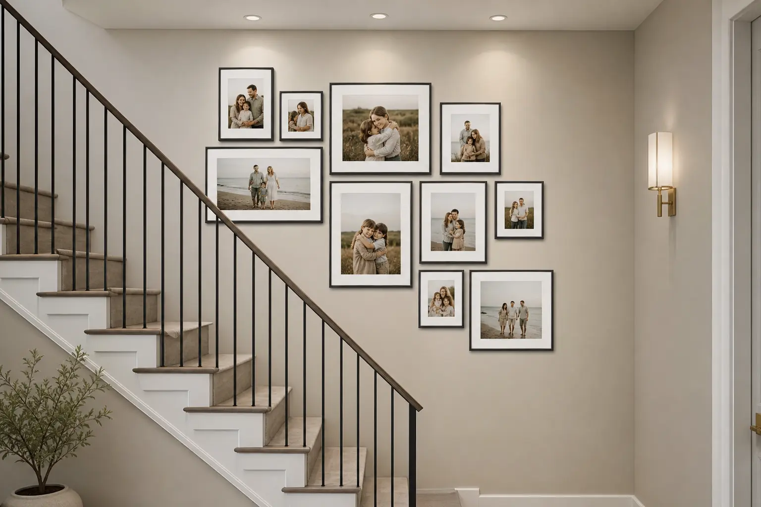
Matching frame color and material, all black, all natural wood, all brushed brass, keeps a mixed size and mixed photo gallery feeling unified. This is one of the simplest ways to make a busy wall look designed rather than thrown together.
If you want some variation, keep it to one contrasting frame finish used sparingly, rather than mixing several different metals and woods throughout the wall. Thin, simple frame profiles also tend to photograph and read better than heavy, ornate frames in a modern hallway.
6. Plan Spacing Before Putting a Single Nail in the Wall
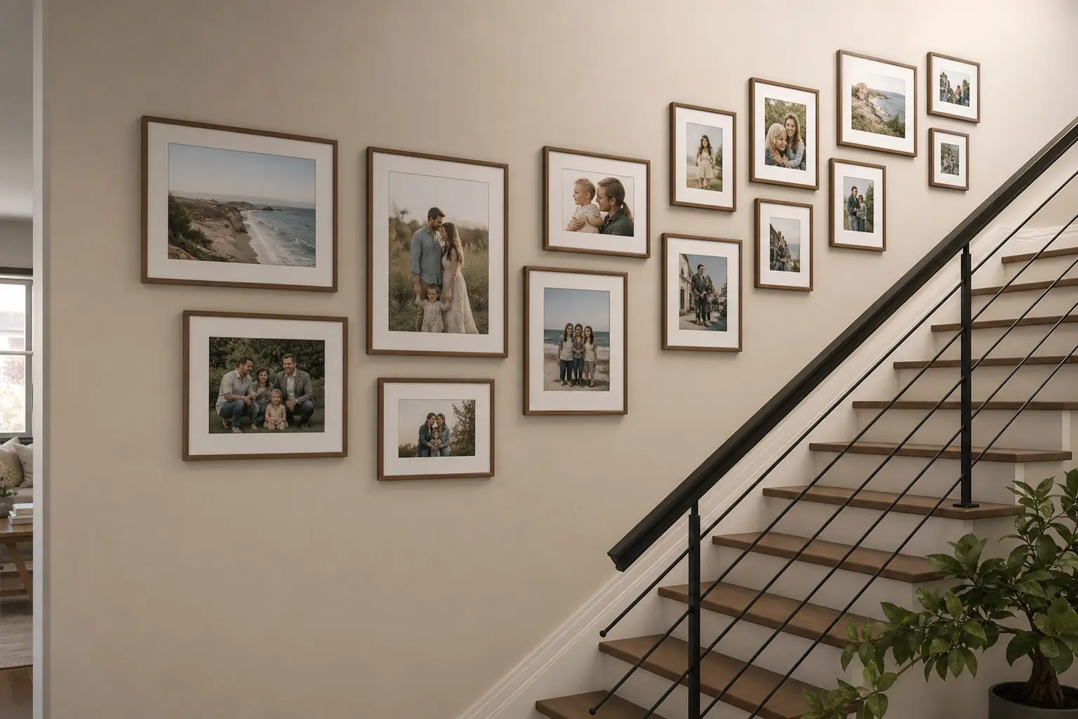
Cutting paper templates to the exact size of each frame and taping them to the wall first lets you test spacing and layout without any commitment. This step catches spacing problems before they become actual holes in the wall.
Leave consistent gaps, typically two to three inches, between frames throughout the layout. Step back and view the taped layout from a distance, and from the bottom and top of the stairs, before finalizing placement.
Why This Step Matters More on a Staircase
A layout that looks even standing at the bottom of the stairs can look uneven from a landing partway up, so check the wall from multiple angles before committing.
7. Mix Color and Black-and-White Photos Thoughtfully
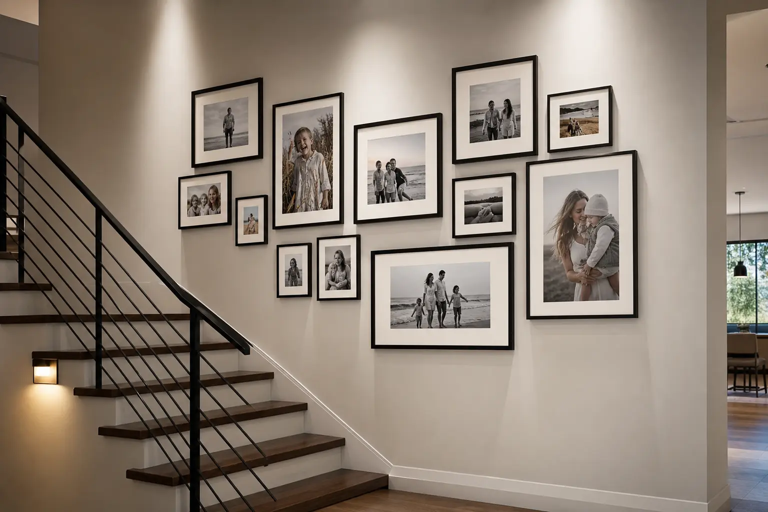
Converting some photos to black and white while keeping others in color adds visual variety and can also unify photos taken years apart with different lighting and camera quality. This works especially well when older photos have inconsistent color tones compared to newer ones.
Aim for a rough balance rather than alternating every single photo, since strict alternation can look more like a pattern than a natural mix. Group a few black and white photos together in one section of the wall rather than scattering single ones throughout for a cleaner visual flow.
8. Leave Room to Add Photos as the Family Grows
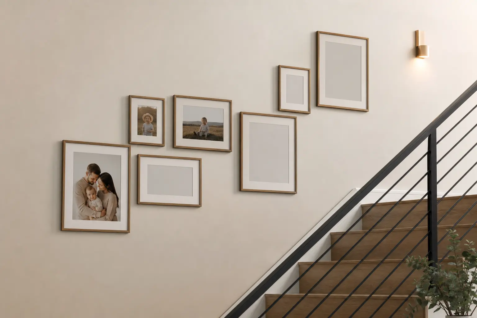
Planning the initial layout with a bit of extra wall space, or a few empty frames left intentionally blank, makes it easier to add new photos later without redoing the whole wall. This matters more on a staircase gallery than almost anywhere else in the house, since these walls tend to become an ongoing family timeline.
Consider starting with slightly fewer frames than the wall could technically hold, leaving room to expand the layout in the same pattern later.
9. Use Templates or Paper Cutouts to Test the Layout First
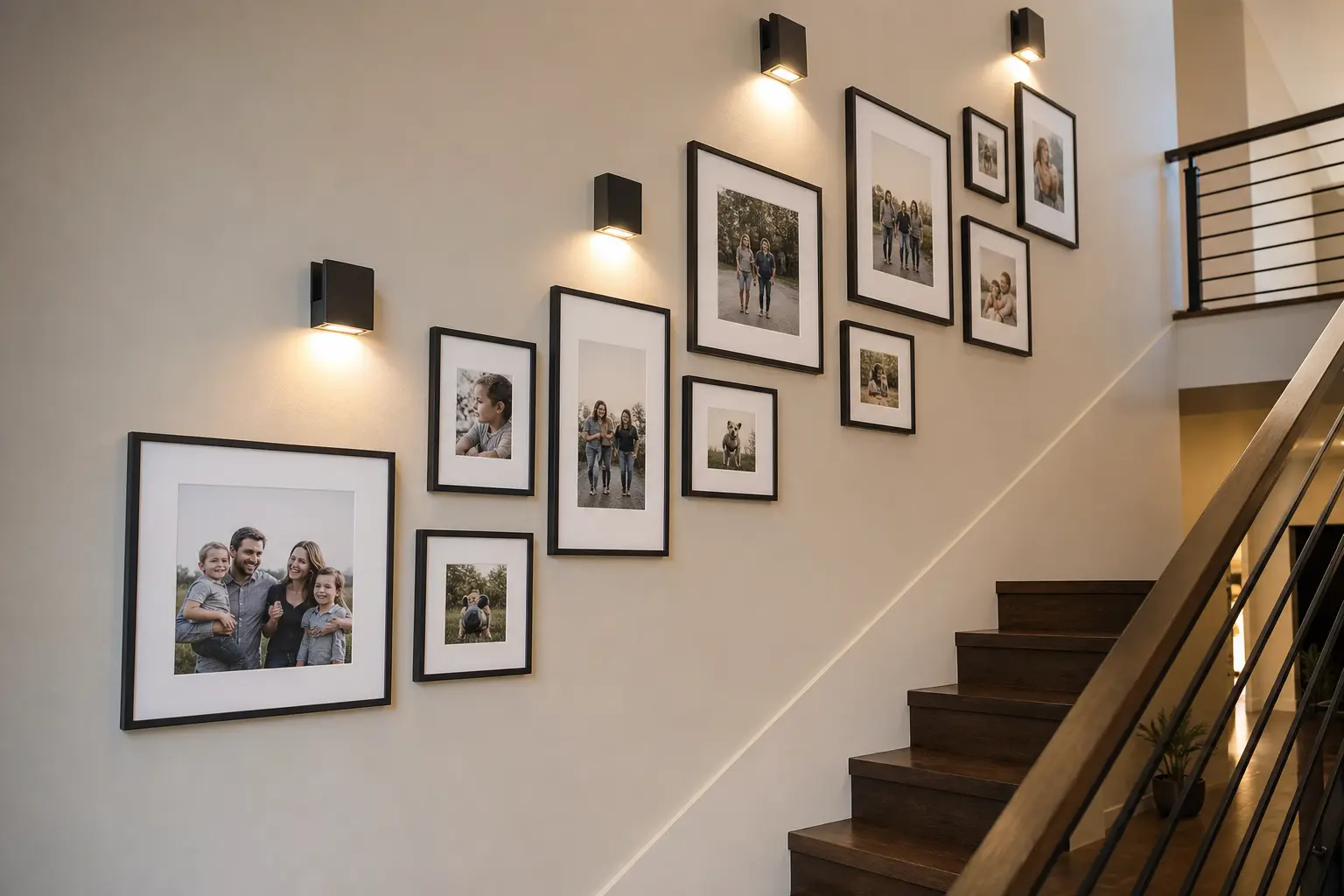
Beyond basic spacing, paper templates let you experiment with different arrangements entirely before drilling anything. Try a staggered version and a grid version side by side using the same templates to compare which suits your staircase better.
Take photos of each test layout so you can compare them later rather than relying on memory. This step takes an extra hour but prevents a wall full of unnecessary nail holes from a layout that didn’t work as planned.
10. Add Non-Photo Elements to Break Up the Wall
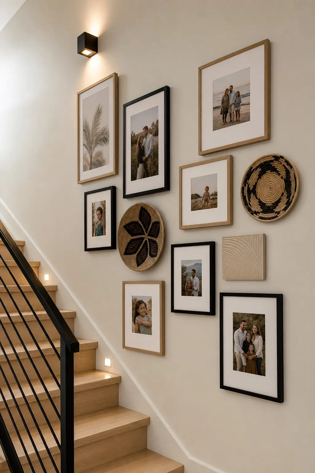
A wall of only photos can start to feel repetitive over a long staircase run. Adding one or two non-photo elements, a small mirror, a piece of art, or a decorative shelf, breaks up the rhythm and adds depth.
Keep these additions to a similar frame finish and scale as the surrounding photos so they blend into the overall gallery rather than standing apart from it. A single well placed mirror can also help bounce light into a hallway that often gets less natural light than other rooms.
Mistakes to Avoid
- Buying frames before deciding on a layout pattern
- Using inconsistent spacing that becomes obvious once frames are hung
- Mixing too many frame finishes or metals across one wall
- Skipping the paper template step and hanging directly from guesswork
- Filling the entire wall with no room left to add future photos
- Ignoring how the layout looks from different points on the staircase
FAQ
How much spacing should I leave between frames on a gallery wall? Two to three inches is a common standard that reads as intentional without looking cramped or too spread out. Staying consistent throughout the layout matters more than the exact number chosen.
Should I use the same size frame for every photo? It’s not required. Mixing two or three sizes while keeping the same frame finish often looks more dynamic than a wall of identical frames, especially on a long staircase run.
What’s the best way to hang frames evenly on an angled staircase wall? Using paper templates taped to the wall first, combined with a level and a measured spacing plan, is the most reliable way to keep an angled layout looking even and intentional.
How many photos do I need for a staircase gallery wall? It depends on the length of the staircase and hallway, but many layouts use anywhere from 10 to 20 frames. Starting with slightly fewer leaves room to add more later.
Should all the photos match in color and style? They don’t need to match exactly, but some consistency helps. Converting a portion to black and white or using a similar photo editing style across the collection creates a more cohesive look.
Conclusion
A staircase gallery wall works best when the layout is planned before a single frame goes up. The staggered or grid pattern you choose should follow the shape of your staircase, not fight against it.
Start with paper templates to test your layout risk free, then commit once you’re confident it works from every angle of the stairs. The wall will keep evolving as your family’s photo collection grows, and that’s part of what makes it worth the planning.